How do you simplify a traditionally complex experience for the everyday person?
As a low deposit home loan provider committed to delivering affordable pathways into home ownership, that’s the question Keystart aim to answer. Every Keystart loan has lower entry costs, low deposit requirements, and no lender's mortgage insurance, allowing people to get into their own home sooner.
The big roadblock stopping Keystart from connecting with more customers was their aging website. The home loan application process was long and complicated, the financial calculators were difficult to use, and the site’s structure and content weren’t intuitive, leaving customers missing out on support when they needed it most.
This resulted in a lack of leads and an excessive number of calls to their customer service for help.
There was an opportunity to make their existing site more user-centric, and distil its complex information so it was easier to qualify
the right people for a home loan while filtering those who weren’t quite ready.

The problem
Keystart’s website was outdated and underperforming. The team wanted to redevelop the site to ensure it was more engaging, easier to use, to generate an increase in higher-quality leads.
The approach
Using a collaboration model, we partnered with Keystart to research their customers, and used an agile methodology and cross-functional teams to design, test, and build key features of the website that would enable an improved user experience, and deliver the customer a service they needed.
The solution
We created a simplified and organic experience for a wide range of home loan seekers, and delivered a website that presents relevant, comprehensible information at key moments throughout their decision-making journey, enquiry, and application process.
Understanding Keystart’s requirements
When Keystart first engaged Equilibrium, it was clear they were seeking a collaborative partner for their website redevelopment process. To meet their requirements we developed a holistic project management package that targeted each one of their needs, with collaborative workshops and methodologies built in, and the flexibility to adapt to any changes in scope as it progressed.
Lindsay O’Sullivan and Roisin Broderick, Keystart’s Chief Operating Officer and Digital Content Specialist, have provided their thoughts on our collaboration together.

Keystart customers
Understanding the key personas and their journeys
Keystart’s existing research provided us with a high-level snapshot of their user journey, which served as a starting point for our own comprehensive research. From here we delved deeper into each user’s needs, so we could pinpoint their specific
pain points, barriers to understanding, and determine the specific on-site journey they would take.
The key personas we extended were based on the customer’s level of financial savviness, budget, ability to save, the level of research undertaken, and confidence in dealing with their finances. This user ability, combined with their
on-site needs, enabled us to map out how this might translate into an optimal digital experience.

The Capables
are looking fora way into the property market now, to start building equity.
- Most financially-savvy customer segment
- Aware of the importance of buying a home
- Pride in successful budgeting and saving
- Thorough research of financial products
- See Keystart as a stepping stone

The Novices
are looking fortaking their first step towards a financially more stable future.
- Not particularly financially-savvy
- Eager to Learn about managing finances
- Minimal research that focuses on lending
- Seeking guidance throughout the process
- See Keystart as a first step, unsure of next

The Dependents
are looking fora way to get into their dream home immediately.
- Least financially-savvy customer segment
- Have a dream of owning a home
- Care more about home design that finances
- Little research into financial products
- Unaware Keystart is a stepping stone
Research data courtesy of Ipsos
Our process

Our collaboration model
During the research and discovery phase, we worked closely with Keystart to better understand their users’ journey. Through a series of intensive workshops, we were able to map out their user's onsite journey, from research and application, through to settlement and the transition stage.
We also teamed up with Keystart’s brand partner to deliver a refreshed, vibrant brand which allowed us the scope to create an engaging, memorable on-site experience.
The in-depth nature of this project meant that we worked closely with Keystart’s in-house IT team to deliver integrations between the Keystart website and their bespoke CRM systems, while creating the architecture that brought the brand to life.


WHAT WE HAD TO WORK WITH
Where Keystart have come from.
Keystart was undertaking a major brand redevelopment, and wanted a website that reflected the tone and vibrancy of the newly developed brand.
Their existing website simply wasn’t converting. Built on a legacy platform that was difficult to administer, it provided an outdated user experience that resulted in a high drop-out rate on the all-important home loan application form, with no information available about the progress of their loan. The confusing nature of this process was leading customers to call the Customer Service line instead, or pushing them away to rely heavily on the support of external brokers.
Understanding complex requirements
Our first step was to understand what the project needed to achieve. Working with Keystart, we were able to pinpoint their user requirements and work back from these to map out the technical needs of the site, and create KPIs to match.
We took Keystart’s consolidated research, and in-depth competitor analyses, and merged this with our own user journey research to create a roadmap that met the customer’s needs, while achieving Keystart’s objectives.

Creating a streamlined home loan process
Keystart’s website is designed to make the complex easy, so the user journey itself needed to be as straightforward as possible.
To achieve this we took a co-design approach. We worked directly with Keystart’s team to map out the customer journey in detail. Through a series of workshops, we outlined each discrete step, the information required at each one, what they user was doing at this time, and what the client should be doing in response.
Together we created a thorough, holistic user journey, and then built this information out to ensure each contained all the necessary content and navigation that would deliver a smarter, intuitive process.


A HOLISTIC PROCESS
Getting into the mind of the user
Our workshops enabled us to get into the mind of Keystart’s customers, by speaking directly with their end-users. What led them to be on the Keystart website? What did they want to see from the website? What was stopping them from reaching their end goal? This qualitative research allowed us to understand their issues, identify their on-site pain points, and determine where there was the opportunity for Keystart to streamline their application experience.

Making the customer’s home loan journey easy to understand at every stage
While all users have a different journey that leads them to the site, we wanted to deliver a consistent on-site experience.
We used specialist software to test the new sitemap and determine the most appropriate content structure, and narrow in on the most logical and easily understandable nomenclature for the site.
At the end of the process, users are then presented with a reason to return to the site, with a series of guides and tips that feature information that’s easily-digestible—and useful—for all customers.

Simple solutions from complex problems
After mapping out each possible part of the customer journey, and digitising this into useable wireframes, we undertook a number of rounds of iterative design testing. This delivered some interesting results.
A complex issue with the website was that users interact with the site in different ways. Our research found that older users prefered navigation to find content, whereas younger users preferred to scroll. This meant we had to design the wireframes for easy use by both distinctly different groups.
To manage this, we designed key calls to action in the home page header to help direct users to the information they needed, and employed a storytelling format to logically structure the content.

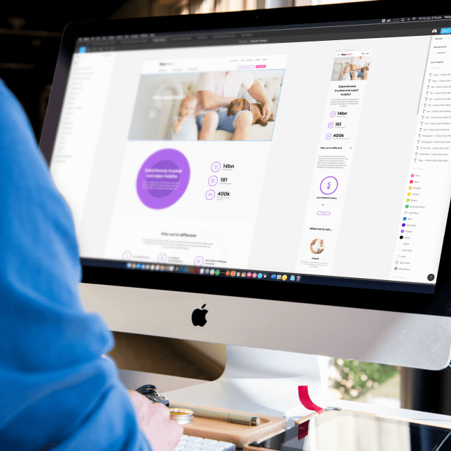
Managing the visual design process


Applying a digital brand that celebrates all of life’s colourful moments
Keystart’s rebrand began with three specific features that needed to all tie together: a colour palette that extended throughout the colour spectrum; a fun, light-hearted photographic style capturing the key elements of ‘fly-on-wall’ moments; and a circular graphic device based around the individual and community.
Combining these three features, we designed a website rich in visual appeal, that supported the key messages and enhanced the customer journey, and provided a better user experience for everyone.
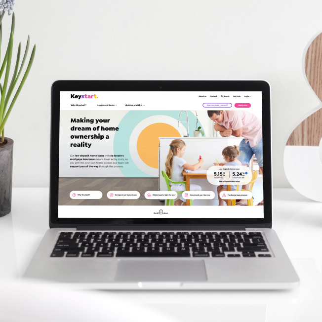
Keystart’s website makes home loans easy
Keystart’s new website provides a vastly-improved user experience, and guides customers effortlessly through the home loan application process. Customers can easily determine whether Keystart is the right lender for them, and clearly see which loan suits their needs. While the application process is still lengthy (the nature of home loans), it’s much more user-centric, and provides guidance and pointers along the way.
Importantly, the new process sets the user’s expectation for what happens at each next step, thereby alleviating pressure on Keystart’s customer service team.

Saving time upfront for customers, and the client
One of the big questions people want to know is ‘how much can I borrow?’ We developed a sophisticated wizard that allows users to enter their financial information directly on the site, which gets relayed directly to Keystart’s bespoke internal business systems, and passes back the user’s eligibility in real-time. This allows them to determine then and there if they’re eligible for a home loan, streaming the qualification process and improving leads for the client.
Customers can also now calculate what their weekly, fortnightly, and monthly repayments will be, based on the size of their loan and interest rates.

Simplifying the home loan application process
Keystart’s existing home loan application form was overwhelming for first-time home buyers. So we simplified it.
We developed a straightforward online application form that’s completely integrated with Keystart’s internal business system, enabling it to assess the user’s eligibility at every point throughout the application process. We reduced the questions to the bare minimum, restructuring the process into two main sections—pre-qualification and application—and regrouped the remaining content into a more logical flow.
Now the entire application is easy and efficient. The website automatically sends all application data to the Keystart CRM, making it available for the home loan assessment team to undertake further evaluation.


Keeping customers informed
As the customer’s application progresses, the new website solution provides them with automatic updates as it moves through Keystart’s system. Now, for example, the user receives an email notification when their application moves from having their loan documents issued, to settlement.
The new tracking portal guides users through the application process, ensuring they’re fully informed throughout the entire application journey.


Resolving customer pain points
Along with the design of the existing site were two key barriers stopping customers from completing their application. We worked with Keystart to create a KPI framework and measurement plan across the entire customer journey, which mapped their specific pain points and targeted overall customer needs at every step.
This ensured that the calculators and logic-based tools we created were written in such a way that they targeted the right customer needs, they could be shared across the site, and that they gathered the user data and structured it into a format that was fed seamlessly into Keystart’s back-office system.


Improving CRM performance
After undertaking a technical selection process to evaluate several CMS platforms, we implemented the enterprise version of Sitefinity, due to its easy-to-use interface, flexible page layout system, quick time to market, and integration capabilities. The website includes a substantial integration into Keystart’s bespoke CRM in order to manage and track home loan applications, and an integration with their internal systems to enable easy retrieval of home loan rates and eligibility calculation.


Enabling post-launch optimisation
With several new home loan finance tools, and a complex application process, it was essential we tagged and tracked all elements of the digital customer journey. This allowed us to methodically work through each pain point, and ensure accurate analysis and optimisation could be achieved post-launch.
The application process required multiple complex event and goal integrations to gain visibility into how people were actually using the form, and identifying where and why they were dropping out. We implemented Hotjar to enable us to track on-page qualitative and quantitative feedback from people completing the application process, which demonstrated real-time problem identification, and acted as a guide for future optimisation.


Ensuring best practice
We worked with Keystart during the content creation process to ensure all their on-page content was written to SEO best practice, and keyword research was considered when creating titles and body copy. We created all meta descriptions, title tags, and internal linking to achieve non-technical best practice, and deliver a seamless user experience from the search engine to the website.
Our experienced team ensured technical SEO best practice was implemented precisely, which included structured data, schema markup, canonicalisation, sitemap submission, redirects, and more.


Building a site that lives up to their promise
Through their new website, Keystart feel like they’ve given their customers the experience they should have been having all along. The new website enables customers to easily and smoothly fill out their home loan application, and provides them with information at every step of the way to make sure they understand what’s involved in the process. The responsive, engaging site matches their vibrant, refreshed brand perfectly.
With a vastly improved user experience, and a simple, step-by-step application process that guides users through, Keystart are able to feel like they’re living up to their goal of helping people get into their home sooner.

The results since launch
-
32.4%increase in users
when comparing the old and new website over the same period of June to July
-
43.8%increase in organic traffic
when comparing the old and new website over the same period of June to July
-
357%increase in online application
when comparing the old and new website over the same period of June to July
Keystart’s redeveloped website lives up to their brand promise
We’re proud of partnership that Equilibrium built with Keystart, and of the success their new site and refreshed brand has achieved.
The new site is easy to understand, flexible, and accessible for everyone—just like Keystart.